CAPspace website
-
Client:
TWICE
-
Project duration:
2017–2018
-
Project skills:
- Visit site
CAPspace provides a network for schools to collaborate with zoos, museums and other schools or colleges via video conferencing. It serves as a noticeboard for user created collaborations and events and to help bring people together to share knowledge and expertise.
The brief
The original CAPspace had been developed and added to over a number of years and so TWICE felt it was time for a refresh. TWICE wanted to make it easier to use, more approachable for first time users so they were more likely to stick around, and more globally focused. There would also need to be a complete overhaul to the look and feel as well as the underlying infrastructure it was built on.
Discovery phase
A complete audit of the platform was carried out to understand the entire functionality of the platform. Around 2 weeks was spent evaluating how users interacted with the platform, through this a project specification was created to addressed any issues that were encountered and suggestions for improvements to help meet the aims of the brief.
Project specification
It was identified early on that CAPspace had become overly complicated during its history. Many processes for simple tasks and core features were hidden away and when a first time user logged in there was an abundance of non-relevant information presented and no instruction of what to do next.
In parallel with the specification a set of wireframes were created. From the wireframes a prototype was created to guide Polycom through how a user would interact with the new version.
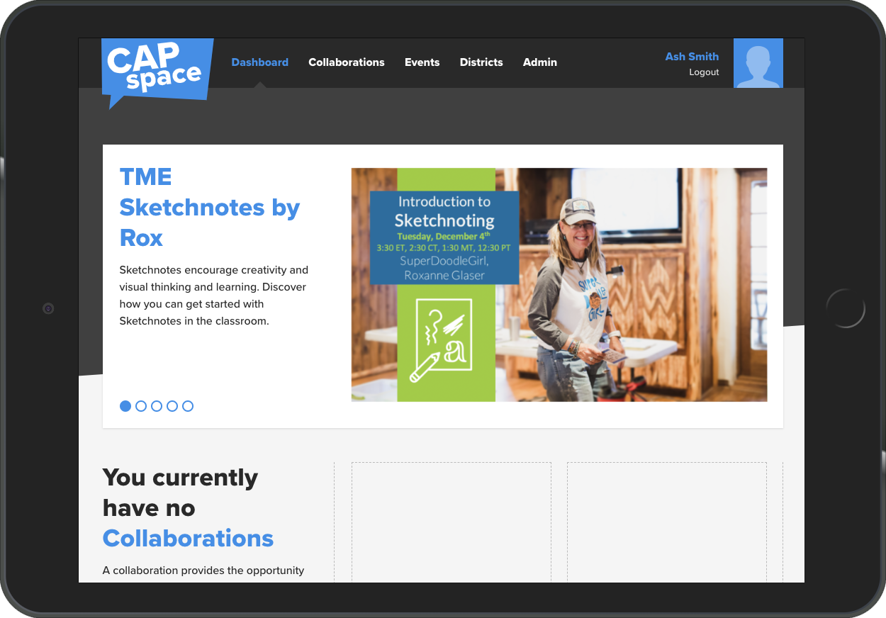
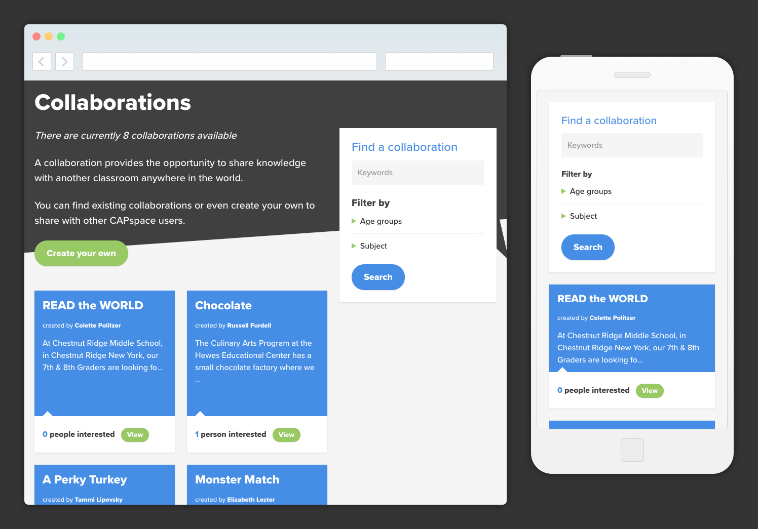
The main navigation was heavily refined. Previously listing 19 options, it was simplified down to just 4. Previously hidden away the two core features (Collaborations and events) were given heavy prominence to make it easy for users to find, create and join collaborations or events from the get go.
Previously, users had information overload when logged in, to avoid the new version only displays information relevant to the user meaning a cleaner aesthetic could be achieved.
We designed and built the website, developing a custom CMS and membership system, as off-the-shelf products were not suitable for the project requirements.
Design phase
A completely new look and feel was created, the new identity provides CAPspace with a more modern feeling. Communication is at the core of CAPspace, so the logo was designed to reflect this.
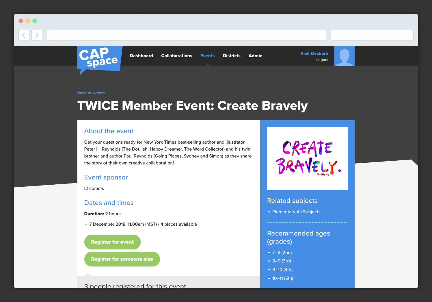
The colour palette was revamped, the original blue was softened and a complementary green added. These 2 colours are then used to distinguish between events and collaborations visually.
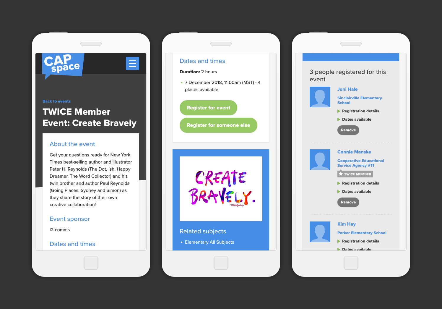
Designed mobile first meant that a clear and consistent hierarchy could be established. Approaching the design mobile first meant content could be progressively enhanced instead of being cut or watered down to fit.